This blog was originally published on Medium
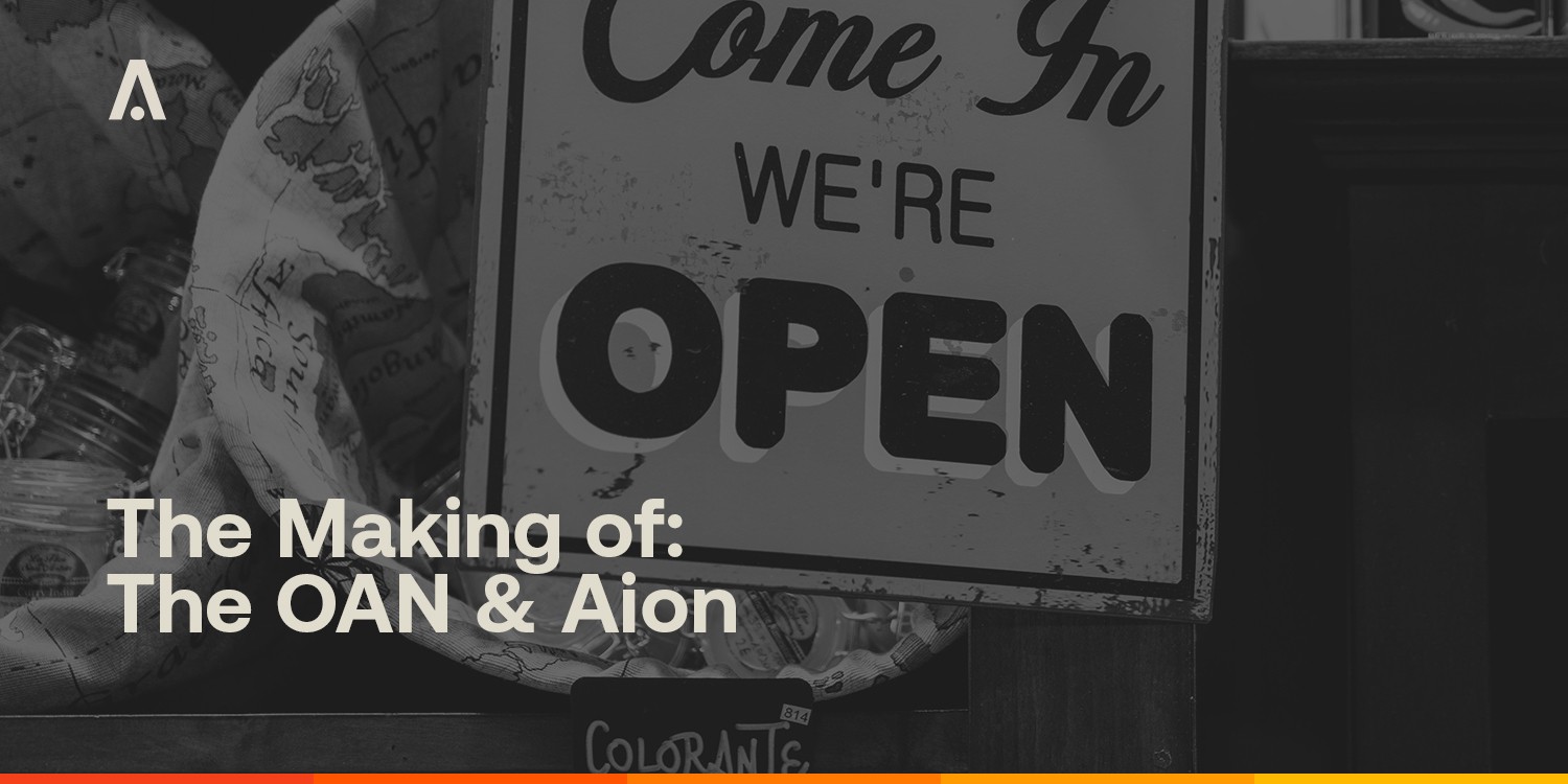
The launch of The Open Application Network and the updated Aion brand on November 4th was a significant milestone for both the project and our team. This launch included both a new POV and strategic direction as well as a major brand update. Although publicly the new brands appeared abruptly, their creation was months in the making so we wanted to share some insight with our community into the strategy and decisions we made to build these brands.
Last week Matt Spoke wrote a blog post explaining our new strategic direction which will give you more context before we jump into the branding below.
Branding The Open Application Network.
The branding for The Open Application Network was inspired by the Swiss Style used by IBM during the late 60s and early 70s; the dawn of the personal computing age when the promise of what technology could bring felt equal parts exciting and science fiction.
We didn’t want the brand to feel like yet another tech company with a two-syllable name set in a lowercase sans-serif typeface hell-bent on being the cool new thing. Instead, we embraced a simple, warm, utilitarian style with an aesthetic rooted in a deep sense of purpose before beauty.
Even calling the brand “The Open Application Network” was a decision made to help reinforce the idea that The OAN isn’t just another tech start-up but a public utility. A longer, more official sounding name reminiscent of organizations like the Metropolitan Transit Authority or the Environmental Protection Agency helps reinforce how developers should think of this public infrastructure.
The Open Application Network’s Primary Brand Logo
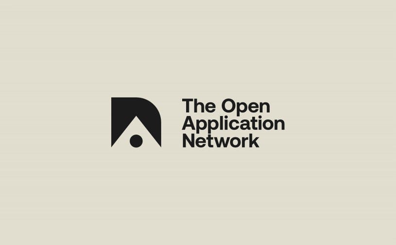
The Open Application Network’s primary logo is set in Aeonik. This typeface seemed almost kismet given the official digital asset of The OAN is Aion. How could we say no to that? The word-mark’s accompanying icon is comprised of an “O” an “A” and a stylized lower case “N” nested within one another. These three letter forms disassemble to work on their own as a secondary mark for The OAN. The idea of being able to work both separately and together is a core value of The OAN. The circle, triangle, and square work as simple shapes that represent the building blocks of the network infrastructure.
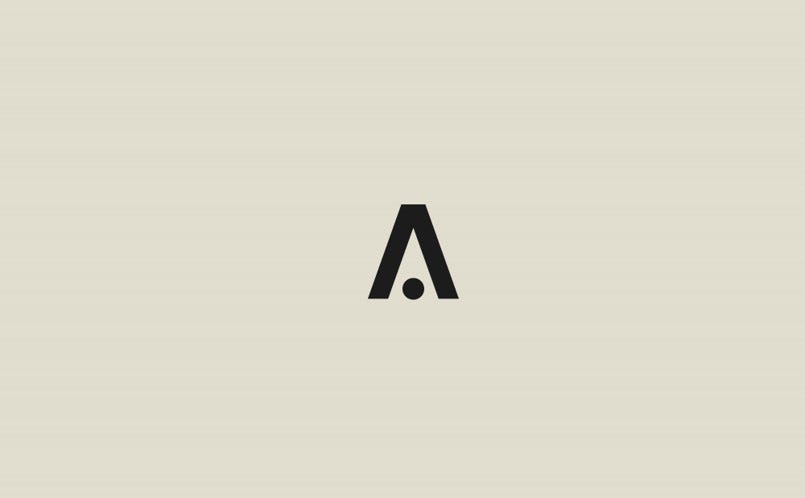
Aion’s New Brand Logo and Currency Symbol
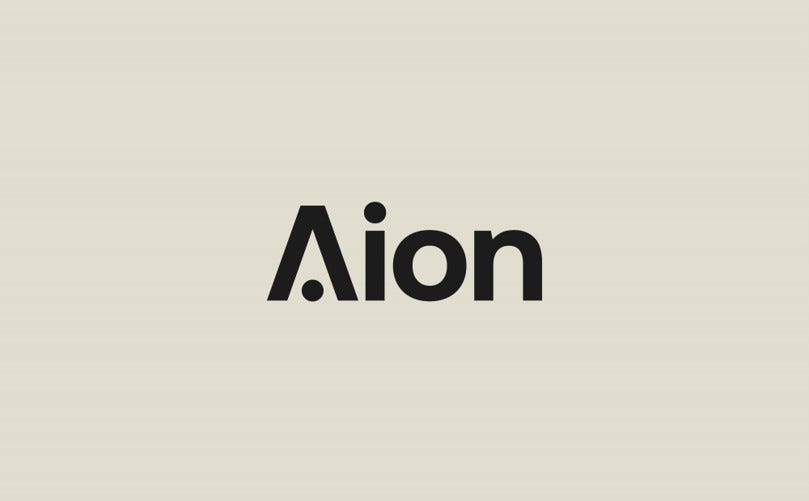
Aion is the digital asset of The Open Application Network. The Aion brand has established equity, especially with the coin-holder community, so we kept the name and updated the visual identity to work seamlessly with The OAN master brand identity. Rather than complicating the system with a secondary mark that would double as a currency symbol we integrated the symbol into the main word-mark for better comprehension and brand recall.
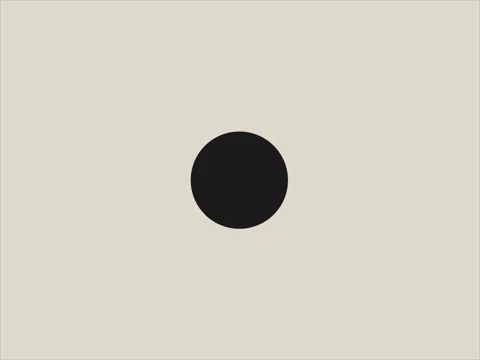
The capital “A” in the new logo is made up of the peaked frame of the uppercase “A” which doubles as a chevron pointing upwards to symbolize prosperity. The cross bar was replaced by a circle the same size as the dot over the lowercase “i” to symbolize a coin. Like traditional currency symbols, the Aion symbol was designed to be simple enough to write with a pen using only strokes and dots. The result is a currency symbol that is incredibly easy to write or type in a variety of weights, and a simple word-mark that feels perfectly at home in the parent brand’s overall look and feel.
Conclusion
None of this would be possible (including this blog post) without the help of our branding and design agency Conflict. Conflict was instrumental in the strategy, design, and execution of these brands and will remain a trusted partner of ours moving forward. They led the creation of our assets from the New York Times full-page open letter to the animations on our Twitter, including a comprehensive brand guideline document. The brand guidelines and logo assets are publicly available to guide our community and partners to make images, videos, and memes on-brand (we love when you do!).
We hope this gives some insight into why these brands look and feel the way they do. We love how creative and engaged our community is, so please send pics of any branded SWAG you make and remember to follow the guidelines as best you can. Reach out to Calvin Sribniak-Jones on his Twitter if you have any questions.